آموزش گرافیک 2 بعدی

آموزش فارسی فتوشاپ : چه زمانی مقدار دیفیوزشن کمتر بهتر است ؟

آموزش های گام به گام فتوشاپ به زبان فارسی : low Diffusion

آموزش های گام به گام فتوشاپ به زبان فارسی : low Diffusion

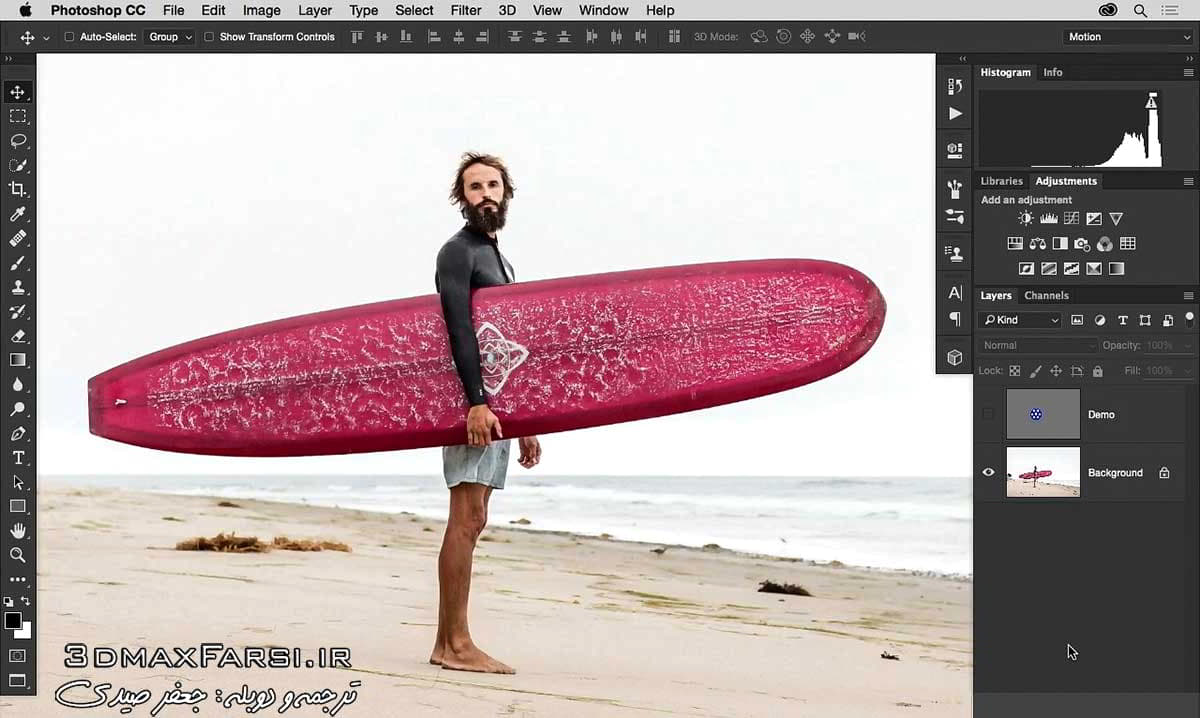
در این ویدئو آموزشی فتوشاپ، میخوام یک جنبه دیگه از ابزار Diffusion control را با هم برسی کنیم .اول از همه با یک لایه دمو شروع میکنیم و بعدش مقادیر دیفیوزشن را برای این تصویر که در بالا می بینید را براش تغییر میدیم.

در این ویدئو به شما نشان خواهم داد که خیلی وقت ها در موقعیتی قرار میگیریم که مقدار کنتراست و روشنایی تصویر ما خیلی متفاوت هست و اگر در این شرایط مثلا اگر از ابزار healing brush با مقادیر بالای Diffusion بخواهیم استفاده کنیم، تصویر ما را کاملا خراب خواهد کرد !

ما گزینه content aware را از نسخه های پیشین فتوشاپ داریم و به خوبی هم کار میکنه. قبل از آن، از گزینه proximity Math  استفاده میشد ولی به نظر ام این گزینه به خوبی جواب نمیده اما اسلایر Diffusion را هم دارد. طرز کارش به این صورت هست که وقتی قلمو را روی قسمتی از تصویر میکشید، سعی میکنه که تکه از اطراف را پیدا کنه و روی اون قسمت کپی کنه.

 فیلم آموزشی : Photoshop video tutorials

پخش آنلاین آموزش : 4 دقیقه و 50 ثانیه

سایر آموزش ها و پکیج های حرفه ای ادیت و روتوش فتوشاپ : جعفر صیدی

دوره کامل و جامع آموزش فتوشاپ در عکاسی : جعفر صیدی

آموزش پست پروداکشن و ارتقا تصاویر : جعفر صیدی

 In this movie, we’ll take a look at one more aspect of working with that Diffusion control and here I’m going to start off with a demo layer and then take a look at how we can change the Diffusion value and then apply what we’ve learned to working on this image. If we click on the visibility of the layer title demo, we’ll see we have this gray background and this blue circle with these white dots on it and I created this just to kind of illustrate that sometimes we’ll have these situations where we have a lot of contrast or brightness value which is different. And often if we try to retouch something like this and say use our Healing Brush here and use a high Diffusion value, what we can do is we can start to see how this actually works so I’ll make my brush a little bigger. Option or Alt click to sample on the background. Let’s say I want to cover up part of the circle. Well as I do that you can that it’s almost kind of bleeding into this area. Now it has really nice blending which can be a benefit in a wide range of situations.


 The majority of the time that’s great yet sometimes it can kind of affect the brightness value of what we want to do. In contrast, if we go ahead and change our Diffusion value to something really low and if I make almost a nearly identical adjustment over here, what we can see is it’s very distinct and different. Take a look at how the white doesn’t bleed in really at all versus over here it’s kind of bending or bleeding into that area. Well if ever you notice that with either
brightness or darkness kind of bleeding in or creating these problems, you may want to try using a different Diffusion value and let me show you perhaps an example of that with the photograph right here. This is a photograph of my buddy, Alex, and let’s say that with this image we decide that we want to retouch away these darker lines on the surfboard in the middle of this area here. With this image we have a lot of pattern. We have a lot of texture, lot of brightness value difference and so I’m going to ahead and use my Healing Brush. I’m going to use this with the Diffusion value of seven because that’s awesome and it almost always works with a higher Diffusion value and what we do is we Option or Alt click on a good area of the surfboard here and then we bring this over onto this area. Yet as we bring that over, all of a sudden if we look closely at that, let me zoom in really close so you can actually see this problem, you can see we have this area where it’s kind of bleeding in these darkness area. They get dark or the white kind of smears out. Well that’s happening because it didn’t really know how to deal with all of that detail or that texture or that pattern there. So rather than using a high value, I’m going to undo that and what I’ll do is go ahead and use a Diffusion value that’s really low and make a nearly identical brushstroke and what we’ll see is that it now just looks a ton better. So in this way you can see that what we can start to do is we can bring over that content without running into that issue where we’re seeing of brightness or darkness so the whole point here is ever you notice that, what you may want to do is just take a look at how you can change your Diffusion value and it might help you out. Now, as a lot of Photoshop instructors will say, if one value doesn’t work try the other and that’s definitely true with the case with this Diffusion slider. Now last but not least, I do want to highlight that we can find Diffusion control in another tool which is the Spot Healing Brush. Now typically for Spot Healing we’ll use Content Aware so we’ll go ahead and let me zoom out a little bit, we’ll say, I want to get rid of some of this seaweed so I’ll go ahead and click and drag or click over that. We can remove that.Content Aware I think was introduced in Photoshop CS5 so it’s been around for a while and it works really well. Previous to that, the way it worked was called Proximity Match. Now Proximity Match in my opinion doesn’t work as well but you’ll notice we do have the Diffusion slider here and the way that this works is what happens is when you paint over an area, it tries to find something in a surrounding area and it kind of duplicates it. If we look closely here you can see it sort of duplicated some of the seaweed over here into this area. When there are situations where you have patterns sometimes this can help in complicated images so it is worth trying out and with this particular feature, again we have that Diffusion control, more defined edges, lower less defined edges, more blending in. We have higher and you can see what I’m trying to do here is just trying to blend that in. Now that being said, I’ve done quite a bit of testing with this and in my opinion I just think Content Aware is so much better even with the new Diffusion control yet I did want to highlight that it is there so if you select Proximity Match you now have that control over there. Although like I said, in most situations, at least in my own workflow, I’m not really using it. I’m using Content Aware more. It allows me to accomplish better results. Well most importantly we’ve started to see how we can vary the Diffusion value and sometimes that can be helpful depending on the task at hand

telegram

دیدگاهتان را بنویسید

دکمه بازگشت به بالا